Monthly Inspiration
This month I am inspired by Junk Mail. :)
The inspiration:

How I was inspired:
Design: Loved the blocks of color and the black strips running through the piece.
Color Combo: Speaks for itself
Typography: Loved the random letters included in the artwork...how some of them were turned upside down, so I incorporated that into my title.
The End Result:

 This weekend challenge is brought to you by Alacey. Love this CD cover she found. Make a layout inspired by it and link it up here for all of us to see!
Alacey's take on this challenge:
"I got the new Toby line from Elsie and it came with a doodled page! SCORE! I loved the doodling on the cd cover! Reminds me of high school. I tried and tried to find a picture of me and Chris when we were in high school but I couldn't!! This picture works too! "

Have fun!
The inspiration:

How I was inspired:
Design: I absolutely loved the way the picture was tilted on this album cover. So I took that part of the design and used it on my layout.
The End Result:

How does it inspire you?
The inspiration:

How I was inspired:
Design: Loved the semi circles. Used them slightly differently, but my semi circles were totally inspired by the CD cover.
Color Combination: Loved the colors, so I found some patterned paper that had a similar color theme. I also used it in my letter stickers...fun way to use up a lot of different letters!
The End Result:

How does it inspire you?
 The challenge: Make a layout based on the above inspiration. Link it here in the comments section, I'd love to see!
My take on this challenge:

The inspiration:

How she was inspired:
Design: "My eyes immediately focused on the curves between the 2 witches....I put my title in the same place but instead of doing another title down at the bottom, I used that space for my journaling. "
The End Result:

How does it inspire you?
The inspiration:
.jpg)
How I was inspired:
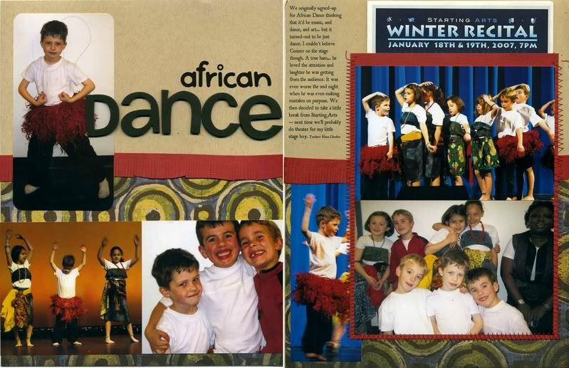
Design: I loved the way pictures made up the letters on this poster. So, I took that idea and made huge numbers to fill with pictures. I was able to get 16 pictures on a 2 page 8.5x11 layout. All of them started out as 4x6 prints and I cropped them down according to my needs.
The End Result:

How does it inspire you?
The inspiration:

How I was inspired:
Design: I really liked the design, but unfortunately didn't have any pictures on hand small enough to do it exactly. Instead I took inspiration from the general design and went with it from there.
Theme/Topic: I really wanted to do a layout about my daughter's violin. Again, I didn't have the pictures to do so and couldn't get them quickly enough to post this week. I am tucking the idea away, however.
The End Result:

How does it inspire you?
The inspiration:
How Lacey was inspired:
Design: "I too didn't have anything to match these colors so I used the dimensions of the cover for my inspiration. I used only my own stash for this layout and that always feels good! And I pulled out those outdated stencils..I love mine and actually use them often!"
The End Result:

The inspiration:

How I was inspired:
Design: As much as I liked the color combo on this one, I couldn't find the right pictures/supplies, so I went with the design only. I replaced one of the solid blocks with patterned paper to create more interest.
The End Result:

How does it inspire you?

The challenge: Create a layout inspired by the above CD cover. When you are finished post it to an online photo or scrapbook gallery and then link it to this post. If you don't want to post it online you can email me at lalakme at yahoo dot com. So get inspired and go scrap!
My take on this week's challenge:
(excuse the shadows on the scan.)

The inspiration:

How Lacey was inspired:
Design: She used the 3 rectangular blocks of color on the CD cover as the background for her layout.
Color Combination: Again, the 3 rectangular blocks of color provided her background as well as the basis for the colors she chose for the rest of her layout.
The End Result:

How does it inspire you?
The inspiration:

How I was inspired:
Design: When I saw this I immediately thought of getting some use out of my huge ribbon stash! I had a lot of fun stapling ribbon to my paper. I sort of rotated everything around to look right with the picture I chose, but my page was definitely heavily inspired by the design on the CD cover!
Topic/theme: The Sun and the Moon, along with the design, reminded me of rays of light. So I used that as my title, referring to my daughters.
The End Result:

How does it inspire you?
The inspiration:

How I was inspired:
Design: I liked the simple design, so I incorporated the entire square CD cover into the larger design of my rectangular layout.
Color Combination: I love doing these inspiration challenges because it forces me to look for paper and embellishments I might not otherwise use. I found some patterned paper that is pretty old that used the colors on the CD cover. It's always exciting to be able to use old stuff!
Typography: I did my best to mimic the way the little tickets were printed out. It took some major text box usage and since my girls all have different lengths of names, I used the option to expand the text with the shorter names so it still looks uniform.
Topic: The "We all Love Ella" morphed a bit into "Why we Love _________".
The End Result:

How does it inspire you?

(inside: Did I miss anything?)
The challenge: Create a layout inspired by the above greeting card. When you are finished post it to an online photo or scrapbook gallery and then link it to this post. If you don't want to post it online you can email me at lalakme at yahoo dot com. So get inspired and go scrap!
My take on this week's challenge: Hilary's take on the same greeting card:
 Hilary decided to use the card to inspire her blog header for the month instead of making a layout.

Can't wait to see what you do!
The inspiration:

How I was inspired:
Design: Mostly just liked the circle there. I was going to place my title the same way the greeting card has it placed, but it just didn't end up working that way. Love that about inspiration...it doesn't have to be exact. Just do what inspires you, and sometimes your finished product doesn't look a whole lot like your inspiration, but the point is, you got it done.
The End Result:

How does it inspire you?
The inspiration:

How I was inspired:
Design: I took the design pretty literally as far as where I placed things. I loved the "pinking shear" look, but couldn't find my pinking shears anywhere, so I just kind of made it up as I went along and inked it to give it more definition.
Typography: I didn't use a font, but I copied the font used on the card with my own handwriting. Since the topic was somewhat childish, it worked well.
The End Result:

How does it inspire you?

The challenge: Create a layout inspired by the above greeting card. When you are finished post it to an online photo or scrapbook gallery and then link it to this post. If you don't want to post it online you can email me at lalakme at yahoo dot com. I will post my favorites next week in each category: design, color combo, typography and topic. So get inspired and go scrap!
My take on this week's challenge:

Hilary's take on the same greeting card:
I love to see how different scrappers are inspired differently...that in itself is so inspiring to me! I can't wait to see what you do!
The inspiration:

How she was inspired:
Design: Notice that she wasn't necessarily inspired by the design as a whole, but rather smaller elements of the card's design. The blue shelf like thing under the flowers is translated to a blue ribbon on the bottom of her picture. The purple down the side looked corrugated to her, so she dusted off her old paper crimper and crimped the paper she used to mat the picture. The dots on the flowers inspired her to add dots along some of the borders in her layout. The whimsical nature of the flowers also inspred her to add some fun curves to the side instead of keeping it totally straight like the card does.
Color Combination: She really loved the fun color combination of the card and took a lot of inspiration from that, ending up with a very vivid layout that matches its title well.
Typography: She liked the whimsical font, so she found one that was similar and used it for her journaling.
***as a sidenote, Hilary said she hated this picture but knew she wanted to scrap it. Those types of pictures are often difficult to scrap because you aren't inspired by the picture itself. So it is nice to be able to use outside inspiration to translate it into a wonderful layout like Hilary did here!***
The End Result:

How does it inspire you?


.jpg)